 Your stats show you’re doing a good job getting traffic to your website. Great! But why aren’t your sales increasing? It may be because your site doesn’t contain a clear call to action.
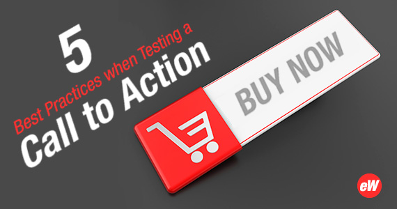
A call to action is a directive to site visitors. Usually via an eye-catching button, it instructs and informs visitors of what to click to navigate to your products, and/or how to complete a purchase. Read on for 5 fast facts about creating an effective call to action, and how it can improve sales.
- Create a sense of urgency to spur action. “Limited Time!” “Ends Sunday!” or “Complete your purchase in 30 minutes to receive a coupon!” are all calls to action that may encourage shoppers to act. Think about what may push your customers to make a purchase decision – whether it’s the idea of trend-related scarcity, finite inventory or an upcoming holiday or gift-giving event.
- Experiment with color. Your site design may dictate what hue will grab your shoppers’ attention best, whether it’s complementary to your current design scheme or a pop of color that stands out, like red in a sea of pastels. Be sure you include ample white space around your call to action so it doesn’t get lost on the page, and avoid animations that eat up bandwidth or detract from your store’s image.
- Buttons bring buyers. A call to action can certainly be pure text on your site, but a button creates an eye-catching and direct pathway to your desired outcome. Naturally, you’ll want to keep your button copy concise so your message is as clear as possible. Consider tightly composed text that reflects your store’s products or your personality; for example, if you sell used books and like to inject your sense of humor onto your site, your button could read, “Book me!”
- Make use of your heroes. It’s likely your website includes a large image of one of your products prominently placed as a banner image. This kind of photo is also known as a hero image, and it helps you make an immediate statement about your store and what you sell. Because that hero image is likely the first site element your shoppers see, make it a call to action as well – easy for visitors to click right through and find that product or category.
- Put calls to action “above the fold.” The term is a carryover from paper newspapers, when important headlines are visible from the top of the paper stack. This philosophy is just as important to websites – don’t make your visitors scroll down in order to start browsing or buying. Put your most compelling photography, copy and calls to action near the top of the screen to help grab shoppers’ immediate attention.
The Bottom Line
With effective calls to action, you’re making it as easy as possible for your products to leap off the pages of your site … and into the hands of your buyers!